
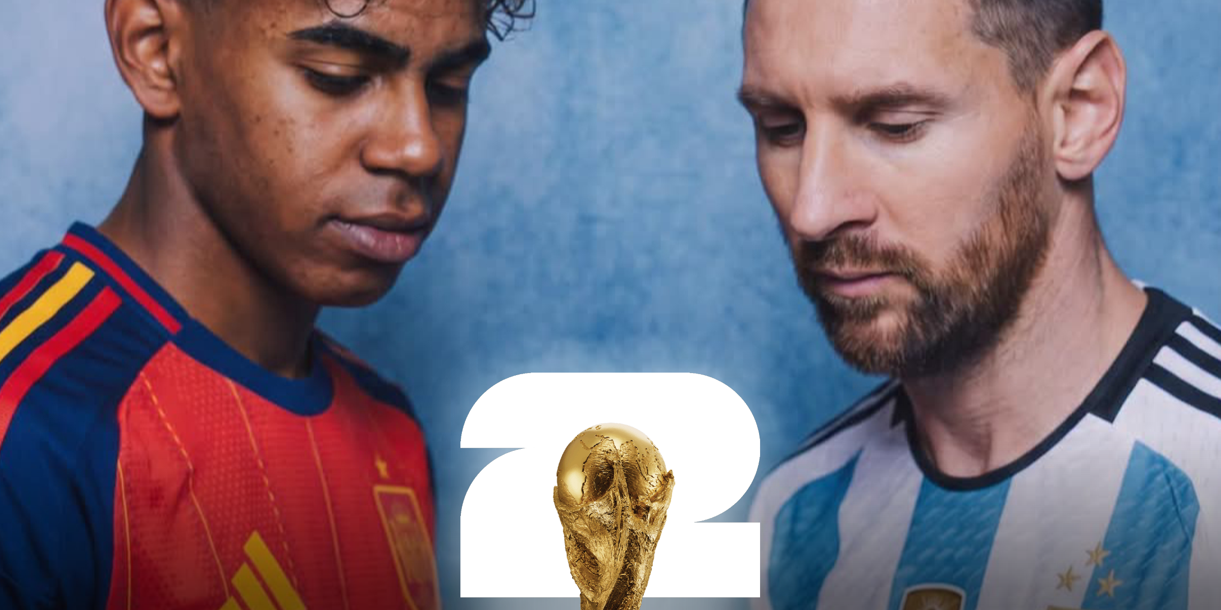
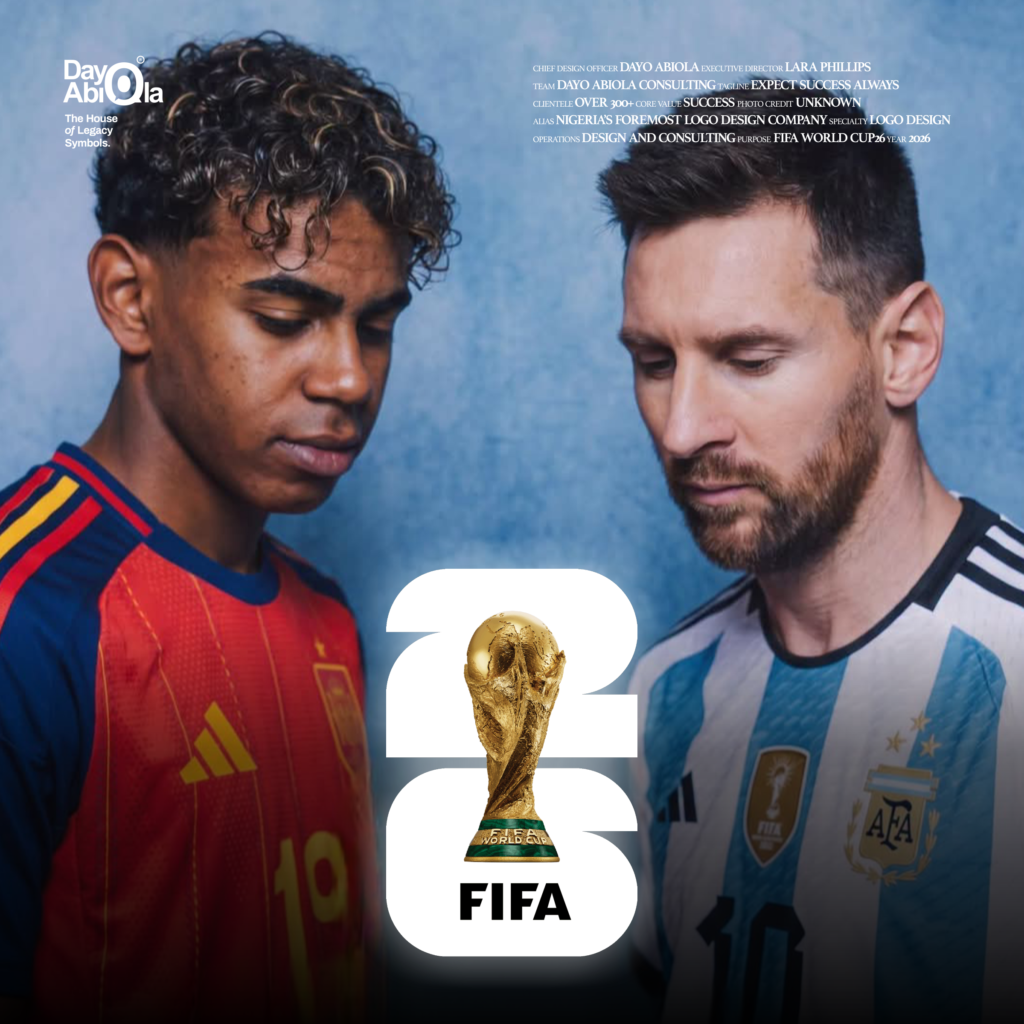
I waIted for this exact moment when the world prepares to witness the climax of the grandest sporting event on Earth to finally address the criticism surrounding the 2026 FIFA World Cup logo. The logo is arguably the most debated visual identity in FIFA’s history. Critics slammed it. Many in the design community rushed to publish speculative, over-designed “fixes,” convinced they had corrected a lazy mistake by FIFA and the design team.
Those who follow my work know that I do not sugarcoat when I critique design. My evaluation always rests solely on global best practices (what many designers know) and strategic decision-making (what only the masters do). Both arm me with objectivity.
It is this commitment to objectivity that allows me to recognize the work of a master instantly. Decades of studying the masters of identity design reward you with an automatic intuition to decipher and make sense of a visual outcome, even without being privy to the initial brief. This is because decision-making packed with courage, boldness, and audacity is the unmistakable hallmark of the masters of the craft. In other words, as we say in Nigerian parlance, “if you know, you know.”
Now lets consider the power of absolute unity in the 2026 FIFA World Cup logo. My objective response to the critics.
This is one tournament across three host nations, not three separate tournaments. It does not require fractured, hybridized iconography; it requires one unified, authoritative identity that represents The Tournament. Attempting to fuse three distinct national aesthetics would have resulted in a cluttered, branding nightmare.
Secondly, the world witnessed radical minimalism as the logo’s definitive stroke of originality. This audacity is daring because the authentic and original 18 karat asset, the World Cup trophy itself in all its golden glory, is the logo for the first time in history. It strips away the noise and celebrates the ultimate prize. Upon this unique attribute, the design team undoubtedly summoned immense creative courage to pitch a concept that appeared to the untrained eye to do almost nothing. They knew the backlash would come, yet they stood their ground. That level of restraint is the true stroke of genius. Ultimately, a great identity must perform before it can impress.
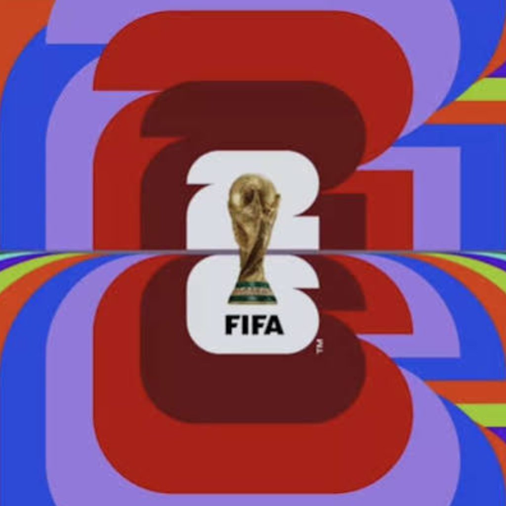
Thirdly, whether on a massive stadium screen, a small jersey patch, or a micro digital icon, this logo scales flawlessly without losing a single visual detail where the complex, overdesigned alternatives suggested by online critics would structurally collapse. The unique, symmetrical white 26 attribute provides the perfect geometric foundation for the organic contours of the World Cup iconography. This masterful arrangement offers definitive proof of the technical and creative thoughtfulness of the design team. It is precisely this structural clarity that gives the identity its peerless scalability.
Ultimately, a logo is a vessel meant to hold the weight of history. By placing the recognizable, pure golden trophy at the center of the tournament universe, a prize that carries a legacy of kisses, tears, discipline, and celebration, the design team created a timeless avatar capable of holding the most staggering human stories unfolding before our eyes. The final match playing out in just a few hours between Spain and Argentina is the absolute vindication of this architectural foresight. This is a golden moment the world is already witnessing in absolute awe, transforming a mere football match into a monumental collision of two destinies.
You see why I love the specialty that logo design is.
In conclusion, look at how reality has transcended fiction. This tournament’s myth-making has been a tapestry of viral human moments, from the Cape Verde goalkeeper whose heroic exploits captured the global imagination, to a final governed by a higher, poetic order.
On this day, the nineteenth of July, nineteen years after a viral 2007 charity photograph that captured Lionel Messi bathing an infant Lamine Yamal, the two icons meet once again on the grandest stage of all. At nineteen years old and playing in his first World Cup final, Yamal wears the jersey number nineteen for Spain, the exact number Messi wore during his own World Cup debut. It is a cosmic alignment of numbers so perfect it feels less like historical coincidence and more like an extension of the golden age of prophecy.
The 2026 logo did not need to invent this story, it just needed to symbolize the golden stage for destiny to play out. As Spain and Argentina battle, the 2026 FIFA World Cup logo stands completely vindicated. Will it be the final ascent of a King, or the coronation of a Prince? May the best team win.